
Repeating the same overused ad templates won't stop your cost per acquisition from creeping up as prospects tune them out.
You need fresh, high-performing formats built for specific buyer intent, real purchase blockers, and smart rotations that catch creative fatigue before it destroys your margins.
By the end, you'll know which format or example fits your current ad frequency and when to swap it before it fatigues.
Here are 11 retargeting ad examples that convert and why they work.
What is a retargeting ad?
A retargeting ad is a paid ad shown to people who already visited your site, app, or social profile but didn't convert. It uses pixel or app data to re-serve ads to warm prospects, people who added to cart, viewed a product, or engaged with content, at the moment they're most likely to act.
What makes retargeting ad examples convert
A good retargeting ad does more than remind someone you exist. It steps into one specific moment in their decision, with the exact context they need right then.
To earn real revenue, every retargeting creative has to clear four bars:
- Behavioral relevance: The creative matches what the person did on your site. A cart abandoner needs a different message from someone who read one blog post.
- Objection handling: The copy answers the real reason they hesitated, for example, price, fit, shipping, or trust.
- A non-generic offer: You don't always need a discount. A guarantee, a free add-on, or an unboxing preview often converts better than 10% off.
- Fatigue awareness: The format changes as impression frequency climbs, so you swap the visual hook before click-through rates drop.
Miss any of these four, and your retargeting becomes less effective. You're practically paying for extra impressions at that point.
The formats below are patterns we've seen work across accounts.
Cart and browse abandonment examples
Cart and browse abandoners already want what you're selling. They hit one specific snag before buying, and these four formats speak to that snag.
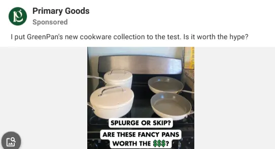
1. Native-mockup comment reply
Standard discount banners look like ads, so people scroll past them. This format mimics a TikTok or Reels comment reply, overlaying a raw product video.
The creator addresses a specific question, like “Is it worth the price?” or “Does this work on sensitive skin?”
The format works because it turns your retargeting message into an answer. Viewers read it as social proof instead of an ad.
- Best used for: High-intent product page visitors who bounced without adding to cart.
- Key element: Direct quote from a customer objection pinned visually over UGC video.
An example is this ad by Primary Goods.
Source: Meta Ad Library. Ad ID: 304612529380311
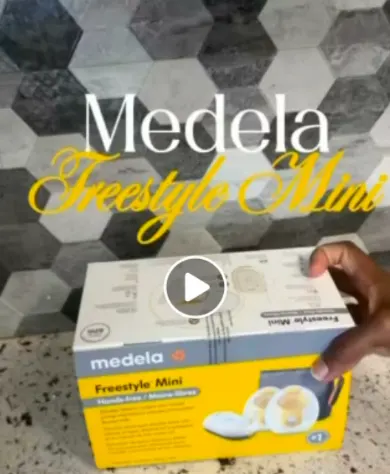
2. High-friction unboxing and fit showcase
Prospects often abandon carts because they can't touch or test the product, and even a polished studio photo doesn't fix that.
This ad uses a quick, unedited video showing the exact contents inside the box or being used.
Seeing the real box and real fit kills the post-purchase anxiety that stalls a lot of carts. Scale, texture, and packaging build more buyer confidence than a studio shot ever will.
- Best used for: Cart abandoners who dropped off at the shipping or checkout stage.
- Key element: Fast, unedited footage highlighting product sizing, materials, or package contents.
A good example is this Medela ad on Meta platforms.
Source: Meta Ad Library. Ad ID: 1402996187833657
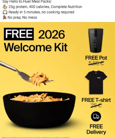
3. Non-discount value add
Slashing prices destroys your profit margins and trains customers to wait for sales. This format keeps the original price but adds an exclusive bonus instead.
The ad highlights a free gift with purchase, complimentary expedited shipping, or an extended warranty.
A bonus item pushes hesitant buyers over the line without touching your price ladder. The buyer feels like they got more, which protects your brand better than a coupon does.
But this only works if the bonus costs less than the margin a straight discount would eat. Price it out before you promise it.
- Best used for: High-ticket items or buyers who abandoned carts without entering a coupon code.
- Key element: Bold text calling out a limited-time bonus item added to their cart.
Nutrition brand Huel uses this format.
Source: Meta Ad Library. Ad ID: 1245669720321696
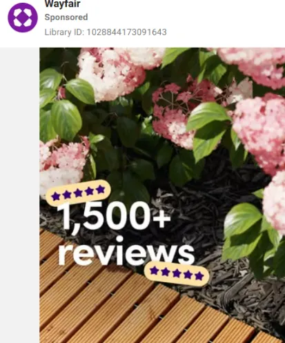
4. Product with star ratings
This format displays a product or a dynamic carousel of the exact item a prospect has viewed.
Each product tile includes a verified customer review count and average star rating directly on the image.
Star ratings stacked next to related products give the buyer social proof and a second choice if their first pick wasn't quite right.
- Best used for: Browse abandoners who viewed multiple category pages or SKU variants.
- Key element: Dynamic catalog feed integrated with real-time review star ratings.
Wayfair applies this here.
Source: Meta Ad Library. Ad ID: 1028844173091643
Social proof and trust-building examples
Prospects often leave because they don't trust your claims yet. A generic quote pasted over a studio shot stopped working years ago. These formats borrow native, unpolished styles to build credibility.
5. The raw iMessage/DM screenshot mockup
Polished testimonials can look staged, but this ad format mimics a real text conversation or Instagram DM between a customer and your brand.
The buyer sends an unprompted message detailing their results, like “Day 14 update: my skin hasn't broken out once.” The brand replies with a quick, authentic response.
A fake DM thread works because it looks like a real conversation in someone's feed as opposed to an ad. It breaks the pattern shoppers have learned to scroll past.
If the copy sounds too polished, the whole format reads as fake instead of authentic. Keep the typos and the casual tone.
- Best used for: Mid-funnel visitors who spent time on key landing pages but haven't bought.
- Key element: Casual, unedited text bubble UI showing specific product outcomes.
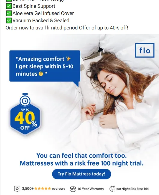
6. Overwhelming social proof/comment stacking
This format displays a fast video scroll or grid overlay showing dozens of real customer comments, tweets, or five-star ratings at once.
The headline highlights the volume, such as “Why 10,000+ people switched this month.”
Volume does the persuading here. Ten thousand five-star ratings remove more risk than any single glowing quote, because one review can look cherry-picked and ten thousand can't.
- Best used for: Bounced visitors who need third-party validation before committing.
- Key element: Rapid visual compilation of authentic user feedback and high review counts.
This ad is by Flo Mattress.
Source: Meta Ad Library. Ad ID: 944806490627932
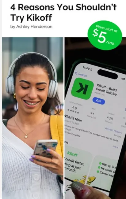
7. Native UI “top 5 reasons” listicle
Static feature lists bore prospective buyers. This format uses an iPhone Notes app or Reddit thread screenshot outlining why users chose your product over alternatives.
The copy lists straightforward, bulleted benefits focused on solving specific pain points.
This mirrors how people already research on forums, so readers treat it as advice.
- Best used for: High-consideration products requiring prospective buyer education.
- Key element: Minimalist, text-first native interface layout with direct benefit bullets.
Here’s Kikoff’s Meta ad.
Source: Meta Ad Library. Ad ID: 2310430089438740
Loyalty and repeat-customer examples
Retargeting existing buyers yields higher conversion rates at lower acquisition costs. Most brands stop advertising once a customer buys, leaving customer lifetime value on the table.
These formats drive repeat purchases by anticipating repurchases and highlighting complementary products.
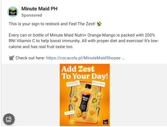
8. The auto-replenishment/restock trigger
Timing is everything for repeat orders. This ad targets customers based on their estimated consumption cycle and shows up right when their supply is about to run low.
The copy uses direct, lighthearted messaging like “Running low on your daily greens?” paired with a simple one-click reorder button.
Timing does the work here, as the ad appears right when the buyer needs it, so they don't have to go searching for your site again.
- Best used for: Consumable goods with predictable 30-, 60-, or 90-day usage lifecycles.
- Key element: Clear timing-based copy paired with a direct call-to-action for fast reordering.
This Minute Maid PH ad is a good example.
Source: Meta Ad Library. Ad ID: 882251738232693
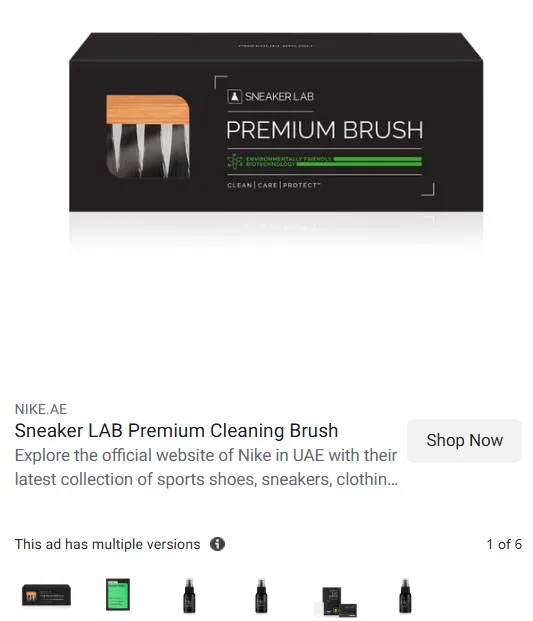
9. The post-purchase “pairs well with” cross-sell
Showing past buyers the same product they recently bought wastes impression budget. Combine it with a complementary item instead, something that improves how they use what they already own.
The creative shows an unboxing or demo of both products working together, like a leather cleaner next to the shoes the customer bought last week, or just the complementary item.
Pairing products this way lifts average order value and feels more like a recommendation than an upsell.
Skip this one if the two products don't get used together. A mismatched pairing reads as a random ad.
- Best used for: Customers who made a purchase within the last 14 to 30 days.
- Key element: Side-by-side product utility framing that shows how the two items work together.
Nike uses this format quite a lot.
Source: Meta Ad Library. Ad ID: 913848761139460
Sequential and stage-based examples
Serving the same ad repeatedly burns through budget and drives prospect fatigue. Sequential retargeting changes your creative based on where the prospect is in their decision process. These formats change your messaging across touchpoints to guide buyers from consideration to conversion.
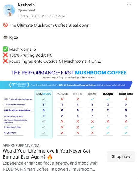
10. Mid-sequence “us vs. them” comparison chart
A prospect starts evaluating alternatives once they know your product category. This format serves as a clear comparison visual after they've visited your site twice without buying.
The creative uses a clean matrix comparing your key features, ingredients, or pricing directly against traditional market alternatives.
A comparison chart lets you control the narrative and not leave it to a forum thread or a competitor's landing page. You answer the “which one's better” question before they go looking for it.
- Best used for: Visitors who spent time on pricing or feature pages within the last 7 days.
- Key element: Scannable side-by-side feature grid highlighting critical product differentiators.
This Neubrain ad explains the difference between their coffee and other mushroom coffees.
Source: Meta Ad Library. Ad ID: 1010444261755492
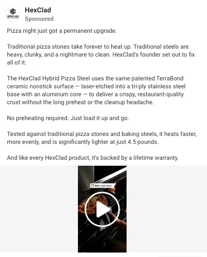
11. High-intent founder “why we built this” video
When direct product pitches stall out, moving to a personal story breaks the pattern. This format retargets engaged prospects with a low-fi, direct-to-camera founder video.
The founder explains the original problem that sparked the brand, including the design flaws they set out to fix.
A founder talking straight to camera converts late-stage fence-sitters because it changes the decision from a spec comparison to backing a person and a story.
This one depends entirely on the founder being a decent communicator on camera. A stiff, over-rehearsed founder video does more harm than a generic ad.
- Best used for: Highly engaged prospects who have visited your site three or more times.
- Key element: Direct, conversational founder monologue focusing on problem-solving over hard selling.
A decent example is this HexClad Hybrid Pizza Steel ad.
Source: Meta Ad Library. Ad ID: 945933351681444
Matching ad format to ad frequency
How well retargeting performs comes down to impression pacing. The same visual asset shown over and over triggers banner blindness and raises your acquisition costs.
To keep click-through rates high, match your creative format to how often people are already seeing it:
| Impression frequency | Best visual formats | Strategic goal |
|---|---|---|
| Lower frequency | Product-focused banners, “us vs. them” comparison grids, direct benefit headlines | Establish core positioning and deliver straightforward conversion offers. |
| Higher frequency | Native UI mockups (iPhone Notes, AirDrop alerts, Reddit threads, comment replies) | Disguise promotional messaging within platform-native aesthetic formats to bypass ad fatigue. |
Frequency thresholds vary by account and audience size. Treat “lower” vs. “higher” as relative to your own historical benchmarks.
Once frequency climbs, people recognize a standard ad structure and scroll past it on instinct. Native UI formats break that pattern. The brain processes them as an organic post first, which buys your copy a few extra seconds before the scroll.
Is retargeting too invasive? Where to draw the line
Retargeting backfires the moment prospects feel watched instead of helped. Over-personalized creative creates friction, and buyers respond by tuning your brand out.
Keep your retargeting effective without crossing into invasive territory by setting clear boundary guardrails:
- Cap impression frequency: Limited exposures to 2–3 per day per platform is a reasonable starting point to avoid overwhelming prospects. Don't treat this as fixed. Test against your own account's fatigue signals.
- Exclude recent buyers: Suppress converted customers from core acquisition campaigns immediately using dynamic pixel syncs.
- Broaden personalization: Avoid creepily specific copy like “We saw you looking at those red boots at 2 PM.” Focus on general product categories or broader benefit statements.
- Set recency windows: A 30-day cutoff after a prospect's last site visit is a common starting point for burning off cold audiences. Adjust based on your typical sales cycle.
When a retargeting ad is fatiguing (and what to do about it)
Creative fatigue happens long before your overall ROAS collapses, and waiting for cost per acquisition to spike means wasting ad spend on dead impressions.
Track these early warning signals to catch creative decay ahead of time:
- Dropping CTR: First-party click-through rates fall below your benchmark over a 3-day rolling window.
- Rising CPMs: Ad networks penalize declining user engagement by charging higher impression costs.
- Frequency spikes: Exposures climbing well past your normal range with no accompanying lift in conversions.
When you spot these fatigue signals, swap the primary visual hook instead of rebuilding the whole campaign. Change the background color, swap the text overlay, or redo the first two seconds of the video. Small tweaks like these keep performance up without resetting the platform's learning phase.
Sourcing and scaling retargeting creative across multiple accounts
Running retargeting across multiple brand accounts requires a systematic production line. Relying on custom, one-off designs for every retargeting campaign slows down output and causes creative fatigue.
Scale your creative output across client portfolios with these strategies:
- Build modular templates: Create standardized layout frameworks for native UI formats, quote overlays, and comparison grids. Swap in account-specific brand colors, fonts, and product shots to ship new variations rapidly.
- Batch UGC production: Request creators film modular hook variations, product demonstrations, and objection-handling scripts in single shoots. Recombine these raw clips into diverse ad variations.
- Systematize competitor mining: Track high-performing competitor retargeting formats across client niches to identify emerging creative trends before every other account in your niche is running the same creative.
How Atria helps you ship (and refresh) retargeting ads faster
Keeping retargeting campaigns profitable requires constant creative iteration. Atria gives you the creative intelligence to see which ads across every channel are actually working and why, so you can double down before creative fatigue kicks in.
Atria accelerates your retargeting workflow through targeted capabilities:
- Radar for decay detection: Automatically monitors creative performance signals across ad accounts, alerting you the moment click-through rates slip or frequency causes fatigue.
- Raya for Competitive Creative Insights: Analyzes high-performing ad formats across your industry to supply data-driven creative briefs, eliminating guesswork when planning fresh variations.
- One-Click Iteration: When Radar flags an ad that's slipping, Raya can take that fix recommendation and generate a refreshed image variation on the spot, so a new version ships in minutes instead of a full designer brief.
Teams like Ipsy rely on these capabilities to replace guesswork with concrete performance metrics.
As Matt Seabrook, Senior Director of Performance Marketing at Ipsy, put it: “I almost never logged into Motion,” he said. “It was pretty infrequent. And now I'm in Atria fairly frequently, mainly because it's picking a lot of the subjective info and making it more objective with data.”
By pairing real-time performance tracking with automated creative insights, Atria helps keep retargeting campaigns performing without burning through ad spend.
Bookmark these 11 retargeting ad examples, match one to your current frequency, and swap it before your account tells you it's already stale.
Ready to stop guessing which retargeting format to run next? Let Radar flag your fatiguing ads before your ROAS does, and let Raya generate the next winning variation from your top performers.
Frequently asked questions
How often should you refresh retargeting ad creative?
How often you should refresh retargeting ad creative depends on your spend and frequency, but a common starting point is 7 to 14 days for high-frequency retargeting audiences and 3 to 4 weeks for first-touch. Watch CTR and CPA, and when either turns, refresh.
Should you always offer a discount in retargeting ads?
No. You shouldn't always offer a discount in retargeting ads. Relying solely on discounts eats up profit margins and trains buyers to wait for price drops. Test non-discount incentives like free shipping, bundled bonus items, extended warranties, or unboxing videos before offering price cuts.
What are the best ad formats for high-frequency retargeting?
The best ad formats for high-frequency retargeting are organic-mimicking formats. They tend to perform best once frequency climbs.
Switch from traditional product banners to iPhone Notes screenshots, direct-message UI overlays, Reddit thread mockups, or unedited UGC videos to bypass banner blindness.
How does retargeting strategy differ for agencies versus single brands?
Retargeting strategy differs for agencies versus single brands in scale and specificity.
Agencies need modular creative templates they can reuse across dozens of accounts without rebuilding from scratch, while single brands can go deeper on one story with custom founder videos, product-specific angles, and post-purchase sequences tailored to their own customers.