
A carousel ad shows 2 to 10 swipeable cards in one ad unit, though some placements cap lower, like Instagram Stories at 3. Each card carries its own image, headline, and link, so one ad can showcase multiple products or tell a sequential story.
I pulled these 12 carousel ad examples from Meta's and LinkedIn's own Ad Libraries, using the same approach covered in Atria's guide to spying on competitor ads, and broke down the decision behind each card.
12 carousel ad examples: TL;DR
- McDonald's pairs two drinks per card under a mood label, like “to hydrate” or “to take the edge off.”
- Volvo Construction Equipment opens with a fixable operational problem before it mentions the equipment.
- Slack's carousel follows a problem, solution, proof, action sequence.
- Starbucks (recruiting) proves one specific benefit with real employee photos.
- IBM builds an argument across several cards before ever asking for a click.
- Wayfair spreads three different bestsellers across its cards.
- Sephora puts an installment price on every card.
- Dell Technologies structures its carousel like a product catalog.
- Airbnb leads with a scroll-stopping image, then answers the question it raises.
- Starbucks (pricing) puts the price directly on the card.
- Visa gives each product capability its own card.
- Nudge Security backs a customer result with a direct quote.
12 carousel ad examples
Design still matters, but it's the decision behind each card that determines whether someone keeps swiping. This guide breaks down what separates a winner from an underperformer here.
Here's what earned each of these 12 a place on this list.
1. McDonald's: mood-match carousel
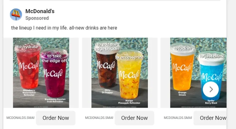 Source: McDonald's, Meta Ad Library, Library ID 1708269720205568
The setup: McDonald's paired two drinks per card and gave each a mood or use case, “to hydrate” next to “to take the edge off,” “to add the edge back in” next to “to accessorize,” and so on.
Why it's smart: it lets the viewer sort themselves by mood, which is easier than parsing a menu item they've never tried. Nobody has to know what a “Dirty Dr Pepper” tastes like to feel like they need something “to add the edge back in.” The label sells the drink before the name even registers.
Steal this if: you're launching several new products at once and worry that listing them by name won't mean anything to someone who's never tried them. Pair products by the feeling or occasion they solve for, and let people catch the emotion before they pick the item.
2. Volvo Construction Equipment: equipment-pairing carousel
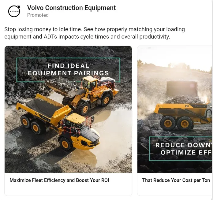 Source: LinkedIn Ad Library
The setup: the ad opens with a line most fleet managers recognize instantly, “Stop losing money to idle time.” It ties that straight to a fixable cause, mismatched loading equipment and Articulated Dump Trucks (ADTs), then walks through finding the ideal pairing and cutting cost per ton.
Why it's smart: naming a fixable problem puts the buyer's situation ahead of the product. “Your equipment might be mismatched” is a sharper hook than “our equipment is great,” and it addresses the prospect's actual stakes before the brand enters the frame.
Steal this if: you sell industrial or capital equipment where the real cost to your buyer is inefficiency. Frame your first card around a fixable problem, and you'll get a stronger read than a spec sheet ever earns.
3. Slack: problem-solution carousel
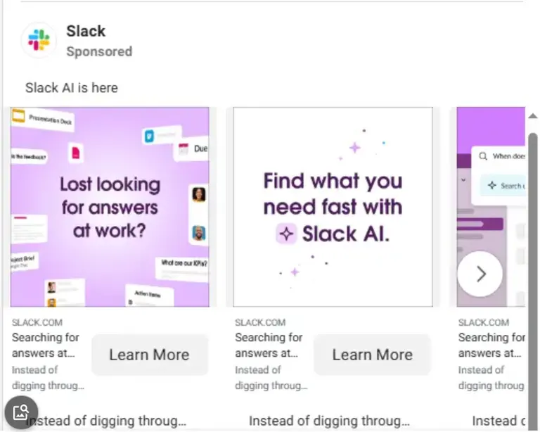 Source: verified ad screenshot
The setup: Slack's carousel names a real pain point right away, search fatigue from digging through busy workspaces. The cards that follow show off the AI feature that fixes it, and a clear CTA card closes the sequence.
Why it's smart: the order mirrors how people get talked into something. Name the problem, show the solution, back it with proof, then ask for the action.
Steal this if: you're selling a product or service that's hard to visualize. Open with the problem, follow with the solution, and back it up with real product screenshots (which are more convincing than stock photography) before asking for a specific action.
4. Starbucks: employee-benefit recruiting carousel
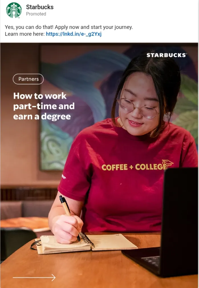 Source: LinkedIn Ad Library
The setup: the cover card features a real employee and a scroll-stopping statement, “How to work part-time and earn a degree.” The cards that follow prove it with real graduation photos: 100% upfront tuition coverage through the Starbucks College Achievement Plan (SCAP) with Arizona State University.
Why it's smart: this recruiting ad leads with one specific, quantifiable benefit, and proves it with real graduates in real caps and gowns.
Steal this if: you're recruiting hourly or frontline talent on LinkedIn. Lead with the one benefit that solves a real trade-off your candidates are weighing, then prove it with real employee outcomes before you ask for the application.
5. IBM: thought-leadership carousel
 Source: LinkedIn Ad Library
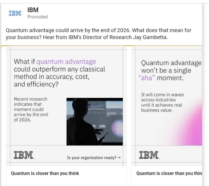
The setup: the ad begins with a specific prediction, “Quantum advantage could arrive by the end of 2026,” then spends several cards building the case before asking the viewer for anything.
The closing card turns that argument into an action, “Listen now,” to a recorded conversation between IBM's Director of Research and author Malcolm Gladwell.
Why it's smart: it sells a point of view and earns the click by sounding ahead of the curve. Bringing in Malcolm Gladwell borrows an audience IBM doesn't have on LinkedIn, turning an abstract, technical topic into something a general business audience wants to listen to.
Steal this if: you're selling something too early-stage or too technical for a direct offer to land right away. Build your argument card by card, then pair your own expert with an outside name who can pull in an audience your brand can't reach alone.
6. Wayfair: multi-category product carousel
 Source: verified ad screenshot
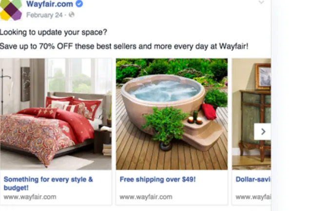
The setup: Wayfair used each card to feature a different bestseller, one from bedding, one from outdoor furniture, one from home accents.
Why it's smart: showing several different products lets Meta's delivery system find the right match for each viewer on its own.
Steal this if: you have a real catalog. Spread it across cards, and lean into whichever product gets the strongest response once you see the data.
7. Sephora: split-payment carousel
 Source: verified ad screenshot
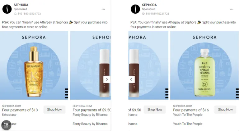
The setup: Sephora paired each card with a different product and its own installment price through Afterpay, treating the payment option like an opportunity customers had been waiting for.
Why it's smart: breaking a price into small installments makes each product look more affordable and gets ahead of a pricing objection before it comes up. Doing it per card means every item gets its own low-friction price tag.
Steal this if: you offer buy-now-pay-later or installment pricing. Put the per-payment price on the card itself, and it will make each product look more affordable at a glance.
8. Dell Technologies: co-brand catalog carousel
 Source: LinkedIn Ad Library
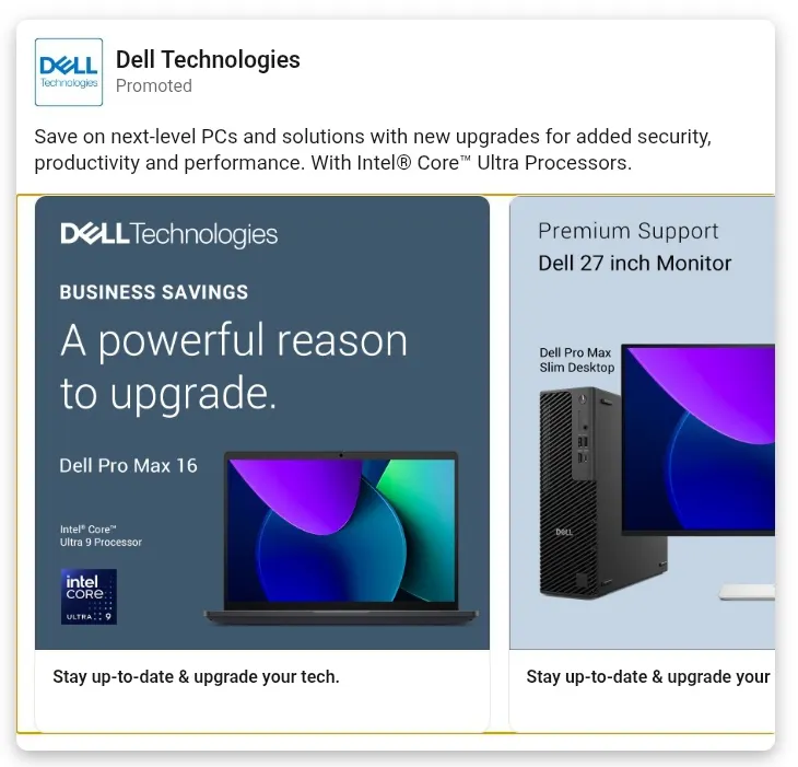
The setup: the carousel works like a mini product catalog. The first card pitches a laptop under a “Business Savings” banner alongside an Intel co-brand badge, the next sells a monitor-and-desktop bundle, and later cards shift into lifestyle photography of someone using the gear day to day.
Why it's smart: the ad sells a whole refresh cycle, and structuring it as “here's the bundle” then “here's what it looks like in daily use” mirrors how an IT buyer plans a fleet upgrade. The Intel badge lends credibility that Dell's own copy can't provide alone.
Steal this if: you sell a product line where customers tend to buy several SKUs together. Give each major purchase decision its own card, and let the lifestyle shot close the sequence.
9. Airbnb: unique product carousel
 Source: Meta Ad Library
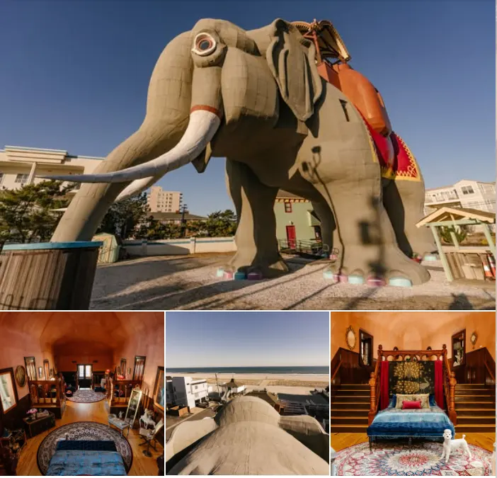
The setup: to advertise “Lucy the Elephant,” a one-of-a-kind rental shaped like an elephant, Airbnb opened the carousel with a captivating exterior shot, then used the cards that followed to reveal the interior room by room.
Why it's smart: the first card does the scroll-stopping on its own, since nothing else in a typical feed looks like a giant elephant-shaped building. The rest of the sequence answers the exact question that image raises: what does it look like inside?
Steal this if: you have a standout product, listing, or feature. Start with whatever makes people stop scrolling, then use the remaining cards to satisfy the curiosity that first card creates.
10. Starbucks: pricing-led carousel
 Source: verified ad screenshot
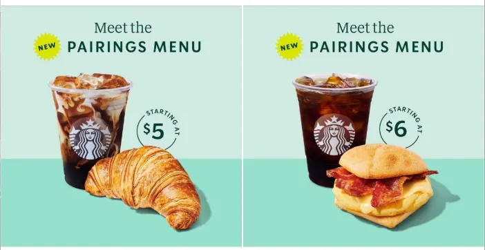
The setup: Starbucks put the price right on the card itself, pairing a drink with a food item at a set combo price for its new Pairings Menu.
Why it's smart: naming the price upfront lets the prospect decide before they click, so anyone who does click is already sold on the cost.
Steal this if: you're running a value or bundle promotion. Put the price directly on the card, and it will qualify your clicks before they cost you money.
11. Visa: capability-led carousel
 Source: LinkedIn Ad Library
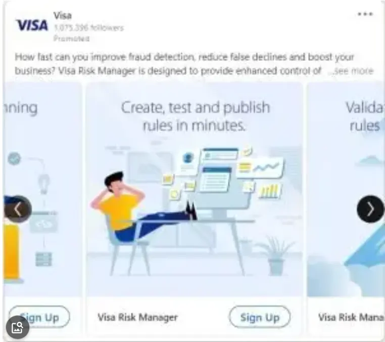
The setup: Visa used its carousel to walk the prospect through specific product capabilities, like fast fraud detection and better risk-strategy control, giving each one its own dedicated card.
Why it's smart: an enterprise buyer evaluating a payments or security partner wants to know what the platform does before agreeing to a meeting, and one capability per card matches the mental checklist that buyer is already building.
Steal this if: you sell a multi-feature product and you're currently squeezing all of it into a single card. Give each capability its own card and let the prospect build that checklist as they swipe.
12. Nudge Security: customer-proof carousel
 Source: LinkedIn Ad Library
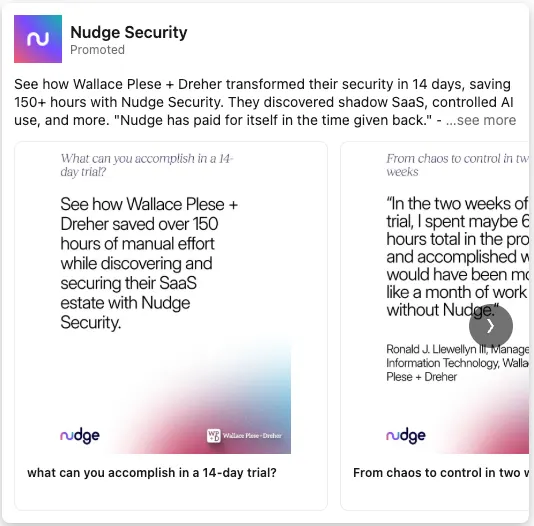
The setup: Nudge Security begins with a named customer saving over 150 hours of manual security work, then uses the next card to back that claim with a direct quote from that customer's IT director.
Why it's smart: tying the result to a real company, a real person, and a real title makes it much harder to wave off as marketing copy.
Steal this if: you have a strong customer result. One named, quantified proof point will outperform ten feature cards.
Why carousel ads work
- One ad unit covers multiple products, angles, or steps in a story, at no extra cost per card.
- Swiping is an engagement signal, which platforms reward with better delivery.
- Each card can link to its own destination, so different interests lead to different landing pages.
- The format works across Meta and LinkedIn, so one creative concept can extend across platforms with only minor adjustments.
Common carousel ad mistakes
- Treating every card as its own standalone ad, which breaks the sequence a viewer expects.
- Mixing aspect ratios across cards, which gets auto-cropped by the platform.
- Leading with a feature list, before earning the swipe with a real hook.
- Skipping a CTA on any single card, which leaves a dead end mid-swipe.
- Reusing the same card order for every audience, when sequence itself is worth testing.
Carousel ads best practices
- Make your first card do the heavy lifting. Your first card sets the tone for the other nine. If it doesn't earn attention within the first second of exposure, the rest of the carousel never gets seen. Fix this first if a client's carousels are underperforming.
- Keep your branding consistent and clean. Every card should feel like part of the same ad. Hold logo placement, color palette, and font identical across all of them, and a clean, uncluttered layout will keep the focus on your message as someone swipes.
- Build a narrative and close every card with a CTA. A carousel that flows from one card to the next sparks curiosity. Whether you're using 2 cards or all 10, give every single one its own clear next step: learn more, sign up, or buy.
- Encourage interaction. A carousel only works if people swipe past the first card. Test at least two different opening cards before touching anything else in the sequence. A next-card arrow, a question-trailing headline, or a card that only lands after the last one, all nudge the viewer forward.
Carousel ad specs and placements (2026)
Here are the specs to check before you build across Facebook, Instagram, and LinkedIn as of 2026.
Facebook carousel ads
| Spec | Details |
|---|---|
| Placements | Feed, Stories, Reels, Messenger, Right column, Groups feed, Marketplace, Search results, Audience Network |
| Number of images or videos | 2 to 10 for Feed, Reels, right column, and Stories (Stories supports video, up to 15 seconds) |
| Image aspect ratio | 1:1 or 4:5 for Feed; 1:1 for Stories |
| Image max file size | 30 MB |
| Image resolution | At least 1080 x 1080 px |
| Video max file size | 4 GB |
| Video duration | 1 second to 240 minutes (Stories: up to 15 seconds) |
| Primary text length | 80 characters for Feed; 125 characters for Stories; 40 characters for right column |
| Headline length | 20 characters for Feed; 40 characters for Stories and right column |
| Description length | 18 characters for Feed |
Worth knowing before you build: only the first card of a carousel shows in the Facebook right column. Messenger inbox placement isn't available for carousel ads in the US, Canada, France, or Australia.
Instagram carousel ads
| Spec | Details |
|---|---|
| Placements | Feed, Stories, Reels, Profile feed, Explore |
| Number of images or videos | 2 to 10 for Feed, Reels, and Explore; 2 to 3 for Stories |
| Image aspect ratio | 4:5 for image-only Feed carousels, 1:1 if any card is video; 9:16 for Stories and Reels |
| Image max file size | 30 MB |
| Image resolution | At least 1080 x 1080 for Feed and Reels; at least 1080 x 1920 for Stories |
| Video max file size | 4 GB |
| Video duration | 1 second to 2 minutes for Feed; 1 to 15 seconds for Stories; Reels carousel cards are images only |
| Primary text length | 125 characters for Feed and Stories |
| Maximum number of hashtags | 30 in Feed |
Worth knowing before you build: Explore is still a live placement, and Explore Home recommends 4:5 creative. A carousel library built only around square 1:1 Feed creative leaves significant inventory underserved.
LinkedIn carousel ads
| Spec | Details |
|---|---|
| Number of images | 2 to 10 (video not supported) |
| Image aspect ratio | 1:1 |
| Image max file size | 10 MB |
| Image resolution | At least 1080 x 1080 px |
| Ad name length | 255 characters |
| Introductory text length | 255 characters (keep under 150 to avoid truncation on some devices) |
| Card headline text length | 45 characters |
Worth knowing before you build: once you save a LinkedIn carousel ad, you can't edit the individual cards afterward. Get the cards right before you publish.
How to know if your carousel is working
Every spec table above keeps your carousel from getting rejected or cropped. Whether it converts is a separate question, since both Ad Libraries show creative and copy.
Start with one carousel ad example above that matches a lever you haven't tested yet, product breadth, a fixable problem, a price on the card, or a sequence that builds before it asks. Rebuild your next carousel around that one variable and keep everything else the same.
Raya, Atria's AI creative strategist, uses creative analytics trained on $9B+ in real Meta and TikTok ad spend to show which hooks and copy are worth building before you launch. Radar then grades and monitors how your live ads perform.
Frequently asked questions
What is a carousel ad?
A carousel ad shows 2 to 10 swipeable cards in one ad, though some placements cap lower. Each card carries its own image, headline, and link. Advertisers use carousels to showcase multiple products, tell a sequential story, or highlight different features in one unit.
How many cards should a carousel have?
Most carousel placements support 2 to 10 cards, and the platform doesn't reward using the maximum. Use as many cards as your story or product lineup needs, and stop once an extra card stops adding a new reason to keep swiping.
How do I create a carousel ad?
To create a carousel ad, you upload 2 to 10 images or videos in Ads Manager or Campaign Manager, add a headline and link to each card, then set your intro text and publish. Meta automatically reorders cards afterward to lead with top performers, but LinkedIn locks the cards for good once you save.
Can I use video in a carousel ad?
You can use video in a carousel ad but it depends on the placement. Facebook Feed and right column support video cards up to 240 minutes, and Facebook Stories allows video up to 15 seconds.
Instagram Feed supports video up to 2 minutes, but Instagram Reels carousels are images only. LinkedIn carousels don't support video on any card.